Sometimes, you need to fine-tune charts, because they just don’t look right. One situation I saw recently was the horizontal chart axis not appearing in the right location. I needed to create a chart from this data for a client:
| Systolic blood pressure | -4.5 |
| Diastolic blood pressure | -3.2 |
Here’s what the datasheet looks like. (Did you know that PowerPoint 2013 brought back the datasheet from PowerPoint 2003?) The data starts in cell A2 because it doesn’t have any header labels.
 And here is the resulting chart on the slide.

Unfortunately, the labels for the horizontal chart axis are inside the columns of the chart. This makes them almost impossible to read. Even if I made them white, they wouldn’t look right. This sometimes happens when you have negative values in your chart.
I found 2 ways to fix this problem. Going into these solutions will show you some of the detailed settings available for charts.
 Adjust the horizontal axis label position
One way to adjust the labels is to directly work with the horizontal axis. Usually, axis labels are on the axis itself, but you can change that. Follow these steps:
- Right-click one of the labels to select the horizontal axis and choose Format Axis.
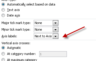
- In PowerPoint 2013, expand the Labels section. and look for the Label Position drop-down list. In earlier versions, look for the Axis Labels drop-down list, as you see at the right.
- Choose High from the list. In this case, you want the High option to put the labels above the bars.
You’ll probably also want to increase the size of the text. To stand out, the text should be pretty large. Right-click one of the labels of the axis and choose Font. In the Font dialog box, select the current font in the Size box. Type a new value and press Enter or click OK.
Here’s the resulting slide after increasing the font size of both axes and removing some irrelevant junk.

Adjust where the horizontal axis crosses the vertical (Y) axis
You can change the value at which the horizontal axis crosses the vertical axis. Follow these steps:
- Right-click the vertical axis and choose Format Axis.
- Whether in the task pane (PowerPoint 2013) or the dialog box (earlier versions), look for “Horizontal axis crosses.”
- In this situation, choose Maximum Axis Value.
Again, the axis labels appear above the columns.
What controls do you use to fine-tune your PowerPoint charts?
Thanks a lot