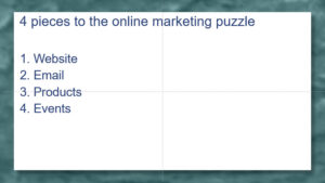
Process diagrams are very useful for depicting (obviously) processes. Processes are a common topic in presentations and describing them with just words doesn’t work very well. In this post, I’ll explain 2 ways to create a process diagram: Let’s start with this slide, “4 pieces to the online marketing puzzle.” The 4 pieces are website, […]
A simple, 4-step guide to beautifully visualize data in your presentations

This is a guest post by Yousef “Yoyo” Abu Ghaidah, a PowerPoint ninja who founded Slide Cow, a learning platform for all things PowerPoint, presentations and public speaking. When he’s not designing slides or giving presentations, he’s on another coffee run. You can follow him on Twitter here. You probably already know that adding illustrations to […]
Changing the order of items in a chart

Have you ever seen this when you created a chart in PowerPoint? Look at the order of the items in the datasheet and in the bar chart itself. They’re the opposite of each other! If you care about the order of the data in your chart, this can be very frustrating! Fortunately, there are 2 […]
Integrating Live Power BI Dashboards into PowerPoint

Introduction At SlideModel.com we create professional PowerPoint Templates to help our subscribers save time creating professional presentation decks. An important segment of our customers is interested in presenting business data and require professional visualizations for this task. Dashboard templates include several charts, cards and visual representations of data in a way that is easy present. […]
Switch rows and columns in a chart

Have you ever created a chart in PowerPoint from data in Excel and discovered that it was configured all wrong? For example, here’s some data in Excel and you want to highlight the change of each income stream from year to year. If you just select and copy that data, start a chart in PowerPoint, choose […]