Solomon Schneider, a faculty member at Sam Houston State University, in Huntsville, Texas, sent me some guidelines for choosing fonts and color to get the highest text legibility.
Color
Medium-colored text + medium-colored background = low legibility. To obtain the best legibility, choose either a very light font on a very dark background or vice versa.
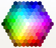
He explains how the familiar color wheel works. (When specifying a font color or shape fill, you get here by choosing More Colors and then clicking the Standard tab of the Colors dialog box. Here it is:

Standard tab of the Colors dialog box
Sol says, “On that color wheel my definition of Very Light is ‘Snow White’ in the center and the Six Dwarfs touching Snow White. Everything outside that first ring of six hexagons is medium until you reach the outermost two rings. All the Very dark colors are on the last two rows furthest from Snow White, although NOT every color swatch on those last two rows is dark.”
He notes, “By my count, 7 very light fonts on up to 35 very dark backgrounds gives 235 high contrast color schemes. Double 235 to cover very dark fonts on a very light background.” So he comes up with a total of 470 legible color combinations.
He adds that “when the audience can’t read text instantly, they quit trying.”
Fonts
Sol provides 5 principles for fonts in PowerPoint:
- Wide kerning (the spacing to the left and right of every letter). For example, Verdana has much better kerning than Arial does, as you can see below.
- At least 28 point text for the slide body for large conference rooms (up to 50 feet).
- Sans Serif font, like Comic Sans MS, or Verdana..
- NO or minimal font special effects. Absolutely no Shadow font (looks like the projector is not focused). Ever read a book in ALL CAPS? Underlining and Italics are fine for words, not sentences. But the most readable effects are COLOR and BOLD. Avoid the rest.
- Many of the Design Templates use medium shades and text with a fuzzy Shadow effect. Don’t use them as a guide to good design.

kerning comparison of fonts